Me, myself and My Banana
Well would you look at that, it’s only gone and turned 2019!
With that being the case, I think it’s long overdue I revive this dusty ol’ blog and actually use it. As mentioned in my 8 Year Anniversary Special (yes, it’s really been that long), I dropped the ball so hard with my original plan to blog that said ball burrowed through the Earth’s layers and popped up somewhere in Australia instead.
So the plan to write blog posts semi-regularly fell through completely. Clearly I was just too happy with my previous Simpsons game essay to bother writing anymore. Sure, I was pleased with it and I hope some others enjoyed reading but…it’s hardly worth purchasing an entire WordPress site for, is it?
To kick things off I thought I’d write up a bit about my thought process when it came to the new look of the channel – the ‘rebrand’ so to speak. And with that comes a look back at my older designs too, and the realisation of just how horrible some of them were. But before all that, maybe it’s time I quickly addressed a question I get quite often…
So, er, what’s the deal with the banana?
People ask me why my logo is a pixelated banana rather frequently believe it or not. It’s a fair question I suppose – I mean what does a banana have to do with a YouTube video game channel anyway?
I’ve never fully answered that question in the past and usually brushed it off with a casual “oh, I can’t remember really.” Lies! I do remember where it came from but even if I told you it wouldn’t make much sense.
Y’see I used to write a little blog back in the day. We’re talking earlier than my YouTube channel, probably by a year or so. No-one ever read it of course, all I was really doing was writing up some silly posts for my own benefit. That stupid blog is a whole other decidedly embarrassing project that warrants its own blog post so I won’t go into too much detail. What I will say is that I named it something banana related…for some reason. In all honesty that’s the bit I really can’t remember because it certainly wasn’t a banana recipe blog, it was more like my own inane ramblings. Akin to a crazy person stuck in a room talking to themselves. In many ways I still do that, just into a microphone for the world to see instead of writing them down.
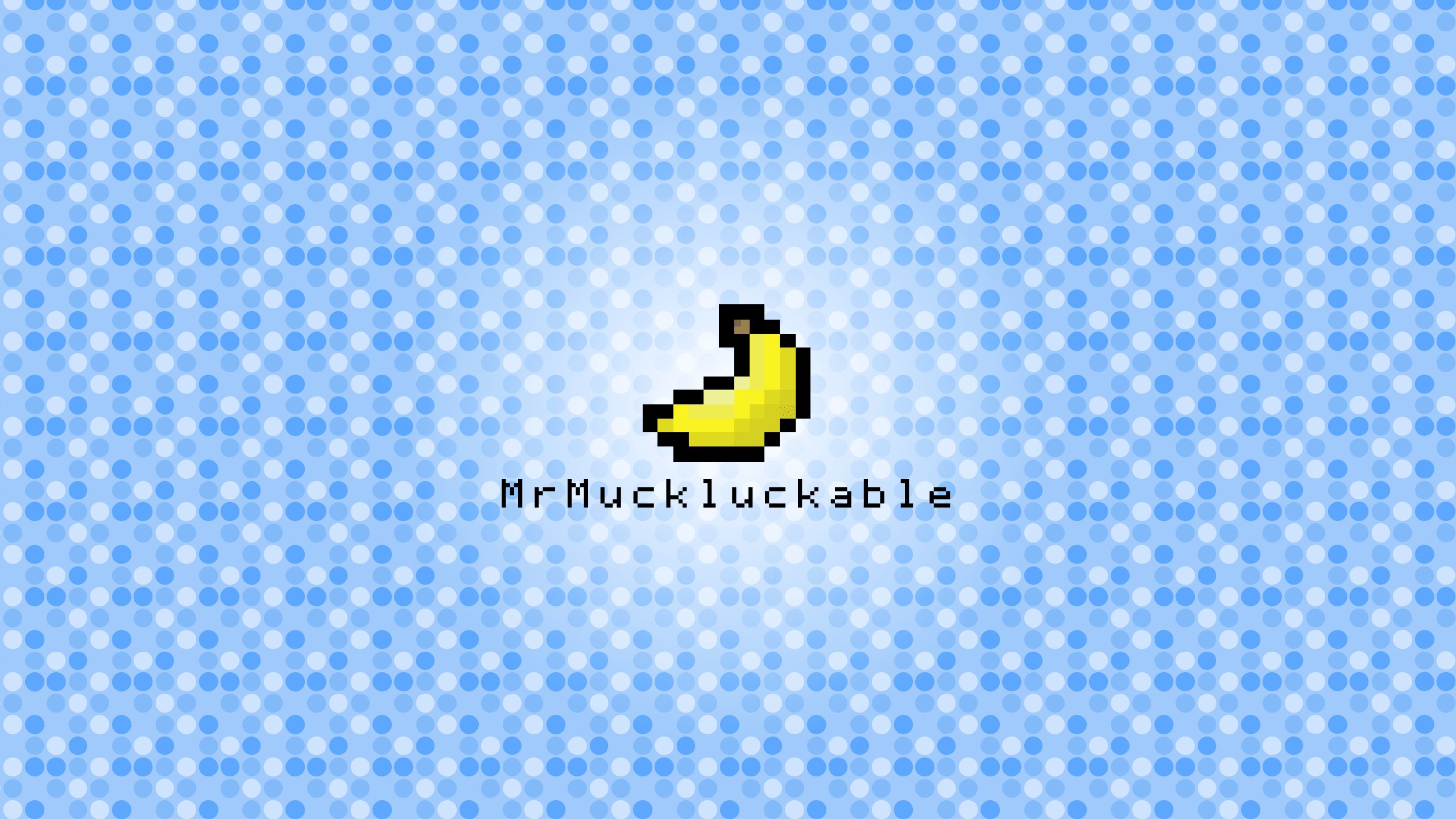
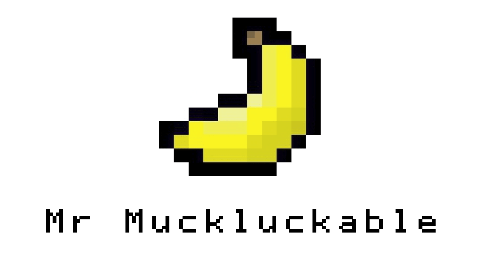
Not long after creating that blog was when I took my first step into the world of Let’s Plays and after the frustrating process of picking a name for it*, I was then stuck on what to set as my profile picture. To make things easy I just nabbed the banana I had used from the blog and voila, my channel was born! And boy, what an ugly baby…
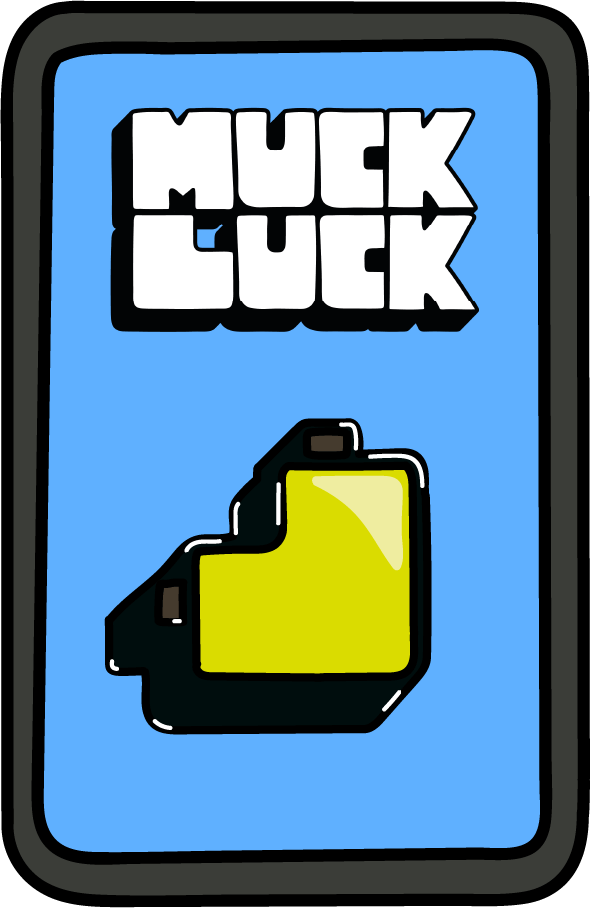
*I’ve mentioned frequently how I originally wanted my channel to simply be called Muckluck but since that channel name was taken, YouTube kept adding suggestions to the word until eventually I ended up with the abomination that was MrMuckluckable. Dark times. I’m glad YouTube finally got their act together and let me change it.
Back where it all began
I had the name, I had the logo. Great! But wait, what about the rest of it? Intros and outros, backgrounds and fonts, all that stuff mattered to me just as much as the actual video content. I’ve always loved art and design throughout my childhood and into school, from Sats to GCSEs to A-Levels. (Speaking of which, I may show off some old pieces of art from school in future blog posts. Artchives!) However, looking at my first foray into design for the channel, you’d perhaps think otherwise.
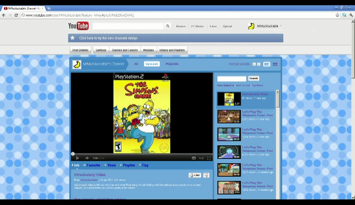
This is the earliest snapshot of my channel I have unfortunately. It’s actually taken from my One Year Anniversary Special video, hence the terrible quality but it’ll just have to do. One thing that’s obvious from the get-go is that blue has always been my main brand colour. It’s probably my favourite colour (ok, maybe turquoise but close enough) and throughout all the designs it’s stuck around. Am I too old to have a favourite colour? Is that just a kid’s thing? Who knows.
For some reason I decided to pick a dot pattern as my main background and let me tell you, it ain’t pretty. Alright I guess it’s not awful but it certainly is dull and doesn’t work with the pixelated nature of the banana. With hindsight, it would have been smarter for me to pick something square-ish in that regard.
But it gets worse. Not long afterwards YouTube changed its design (the first of many) and took away the ability to customise your background. Instead we were left with only a banner to modify and this is the design I eventually whipped up…
How to make that dull dot pattern worse? Stick a nasty gradient on top of it. Gradients in design aren’t naturally bad but, more often than not, they look terrible. In my opinion you’ve got to be subtle with them and that white gradient is anything but.
Oh look, a font too. To match the pixelated banana, I chose a pixelated font. It’s actually a TrueType version of the font used on Apple II computers back in 1970s called Print Char 21. So if anyone happens to have one of those and boots it up, you might be reminded of me.
I kept using that font up until only very recently when I rebranded the channel in January 2019. About time, eh? Looking back, I should have changed it sooner – not only is it quite sterile and dull, but it’s also quite limiting in its use. And perhaps most importantly, I don’t really think it reflects me. Sure it kinda reminds you of retro video games but the font style is quite aggressive and no fun at all.
Sometimes I wouldn’t even bother with a background! Take a look at some of these masterpieces I created between 2012 and 2017. Talk about laziness…
 |
 |
 |
I-dent see an issue
It’s not all doom and gloom though. Believe it or not there is something I’m still happy with from back in the day. Towards the end of 2014 I finally decided to create an outro for videos and make use of annotations which YouTube had introduced in 2008.
Outros are the ideal spot to recommend more videos or playlists for the viewer. Back then of course there was no auto-suggest feature that YouTube uses now, so instead I made multiple versions each with different Let’s Plays which I’d link through to. Stick on a couple of references to my Twitter and Twitch and Bob’s your uncle, I was set!
Except not quite. The outro couldn’t be silent after all, so the next issue was what song to use for it. I remember looking all over the web for royalty free music to ensure that my videos weren’t unnecessarily struck with copyright claims.
Kevin MacLeod, or Incompetech.com, is probably one of the most prolific music makers heard on YouTube because of his vast royalty free music collection. Skim through some of his tracks and you’re bound to recognise something from Sneaky Snitch to Spazzmatica Polka. I eventually opted for Hyperfun, a bouncy, bright and humorous track by his own definition and something I thought suited an outro well.
Keep it simple stupid
My channel design stayed pretty much the same until around midway through 2017. It was at that point I was about to start two new Let’s Plays (Escape from Monkey Island and a replay of Destroy All Humans! 2). For a while I’d been eager to modernise my branding and that seemed like the most logical point to do so.
But after 6 years it felt as if it has been too long to drop everything. By that point my channel identity was pretty much synonymous with that silly pixelated banana, or at least in my head it was. And at any rate I wasn’t looking for too drastic a change, just a little something to spice things up and bring my channel up to date with newer design trends.
And that design trend was the rise of flat design. From 2014 onwards, flat design has dominated the likes of Apple and Google – just take a look at the app icons on your phone. Granted I was a little bit late to the party but that simplified style was something I wanted to implement into my channel.
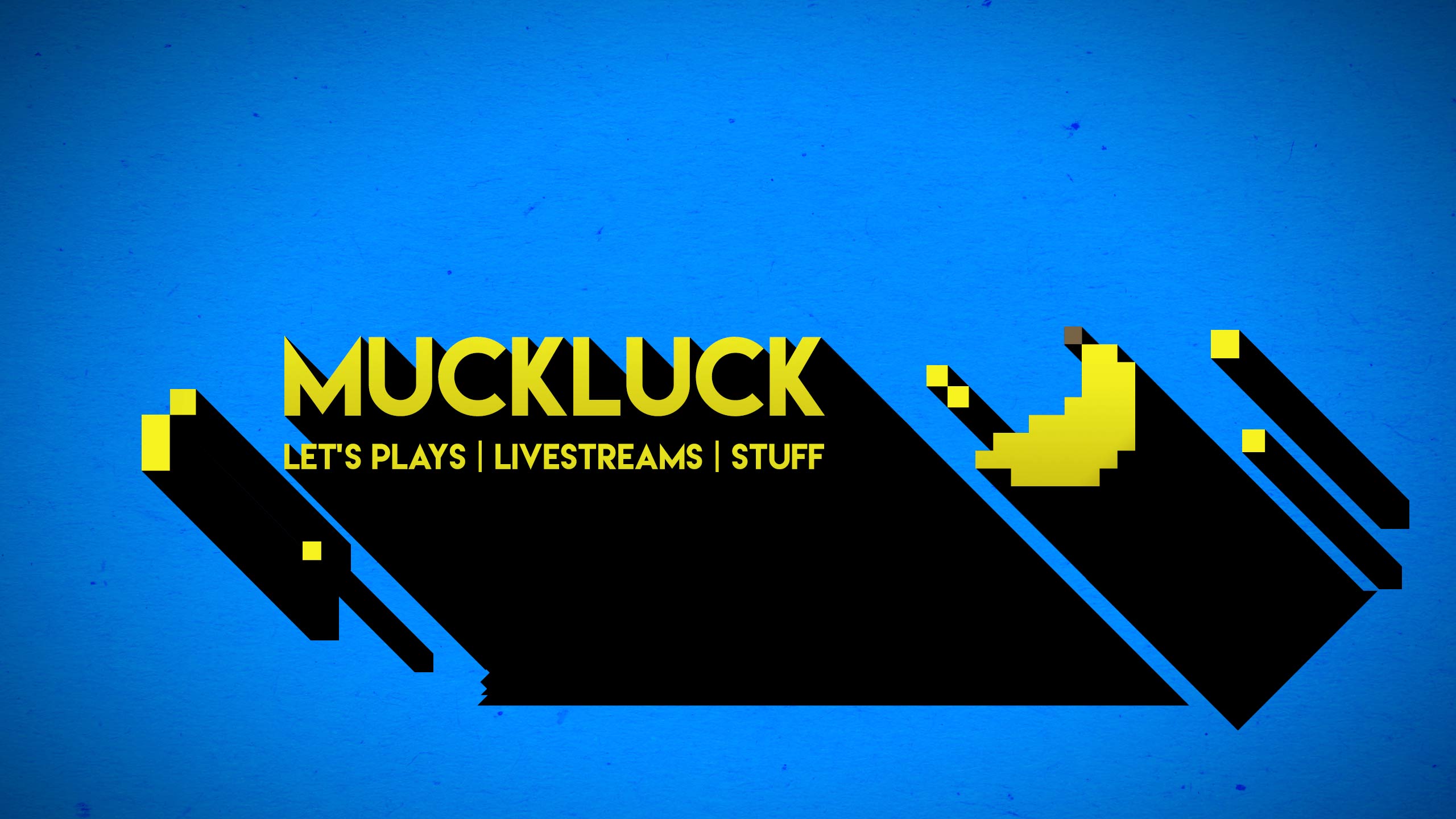
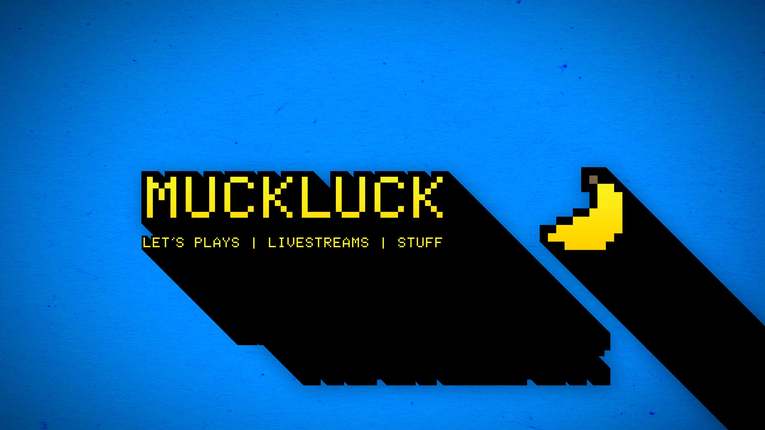
Ultimately, I scrapped the individual pixels of colour in the banana and replaced them with a gradient. Gasp. Shock. Horror! But Muckluck, you said gradients normally look terrible? Alright, I replaced them with a very subtle gradient that’s hardly noticeable. I think the concept worked and eventually I added in a long shadow aspect to it too for things like banners and an updated outro.
To counteract the sharpness of the shadows I tried adding a small amount of background paper texture and even played around with different fonts such as Lemon/Milk and Plump. For consistency’s sake, the Print Char 21 font remained but for the most part it all looked a bit more crisp and clean.
 |
 |
 |
New year, new me
A similar situation caused the most recent design change. Towards the end of 2018, with no Let’s Plays going on and a whole lot of time off from work thanks to the Christmas break, I decided to rebrand once again. I wasn’t necessarily unhappy with the look at the time but there was still that little voice in the back of my head thinking it could represent me a bit better.
The seed had been planted for a new look way back in September 2017 with my video How I Create Let’s Plays. Since that was a standalone video I decided to do things a bit differently and opted for a more handmade, messy design. Roughly cut-out edges and squiggly lines made things look friendlier and when it came time to update the whole brand; this is the style I wanted.
There were other factors too. It just so happened that in my YouTube homepage recommendations a SuperMega video was suggested. SuperMega is a channel I’d heard of before but never got around to actually watching. To be honest, that’s still the case now but the thing that did catch my eye was their logo.
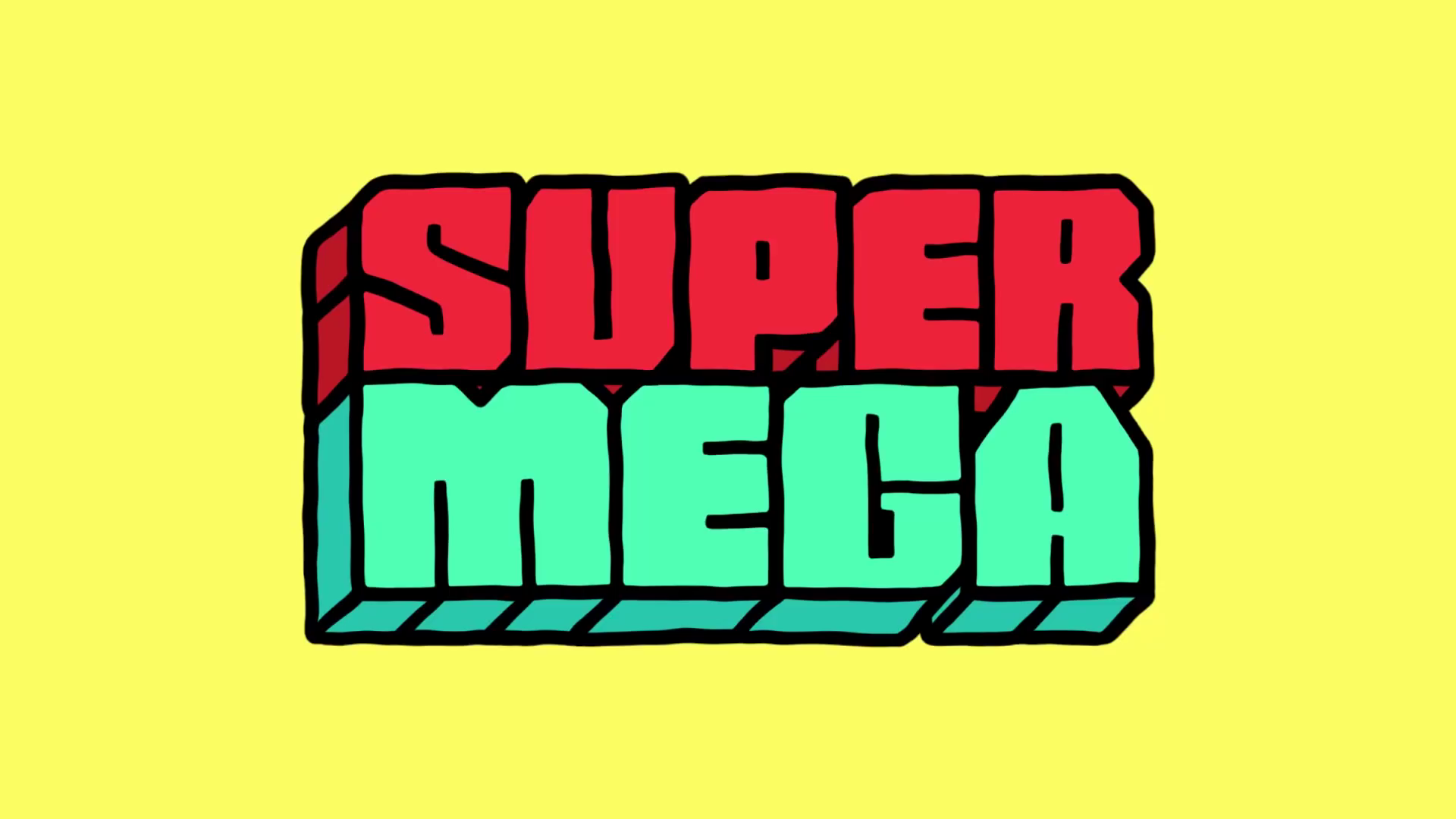
I love it. I love the blocky, square design of it and the wobbly hand drawn strokes. It has a retro feel to it but not overly so – it could work with anything really. I dug a bit deeper and discovered their intro, an incredibly short but effective clip of their logo animating. I say animating, the term is boiling. It’s actually what I was referring to when I mentioned the squiggly lines of my How I Create Let’s Plays video. Boiling is simply redrawing the lines of a picture and alternating between slightly different frames of it to create a tiny amount of animation – it’s a cheap and easy way to add visual interest to a video.
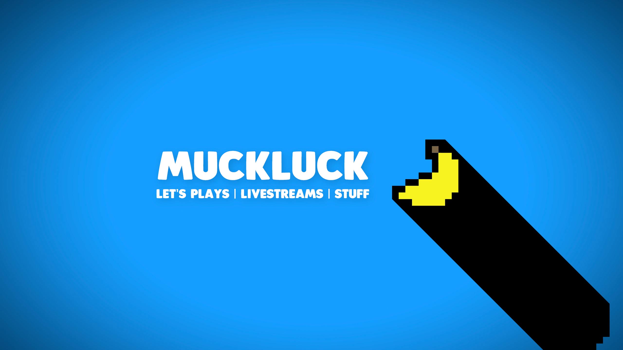
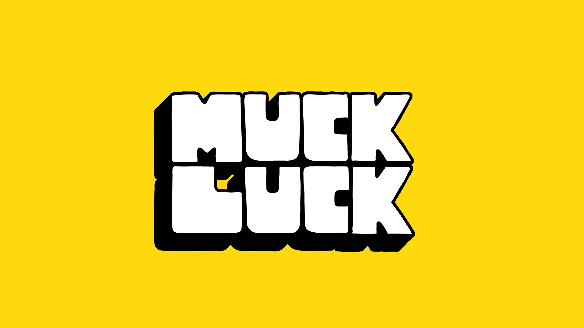
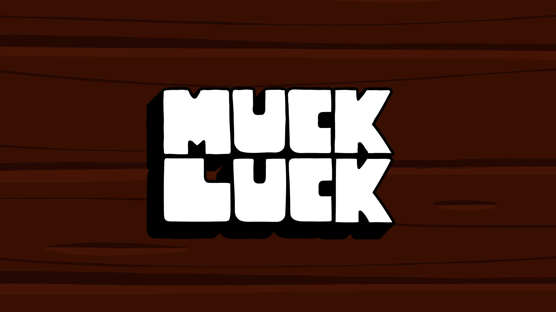
So that was it – that was the style I was after. It’s more welcoming and fun. It’s more laidback and flexible. Looking at my finished product it’d be fair to suggest I simply copied their logo but that was never the intention. Alongside the hand drawn style, I had wanted to move away from relying on the banana logo in branding for a long time. Sure, I bet a lot of people associate it with me but from a far too serious business perspective, I’d prefer people to recognise the word Muckluck more instead. I wanted to emphasise my actual name more and what that meant it putting it front and centre, not the banana.
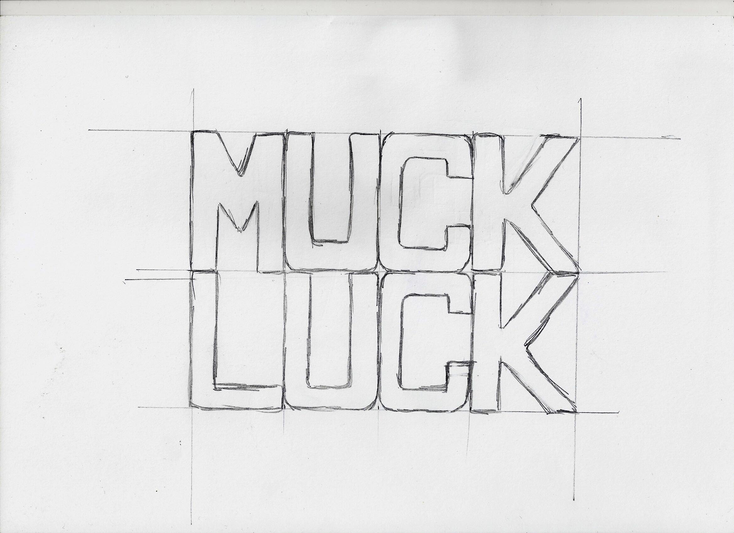
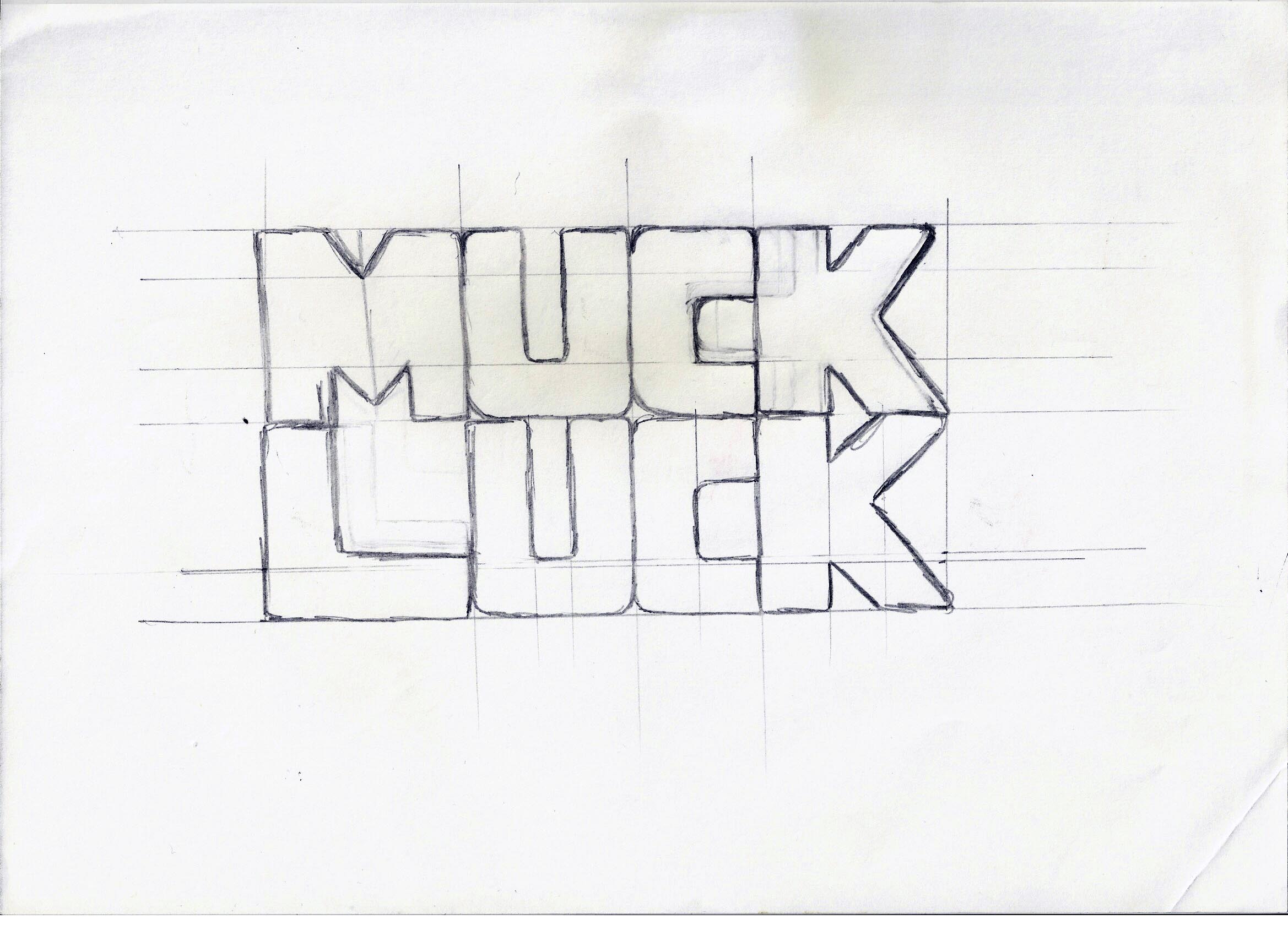
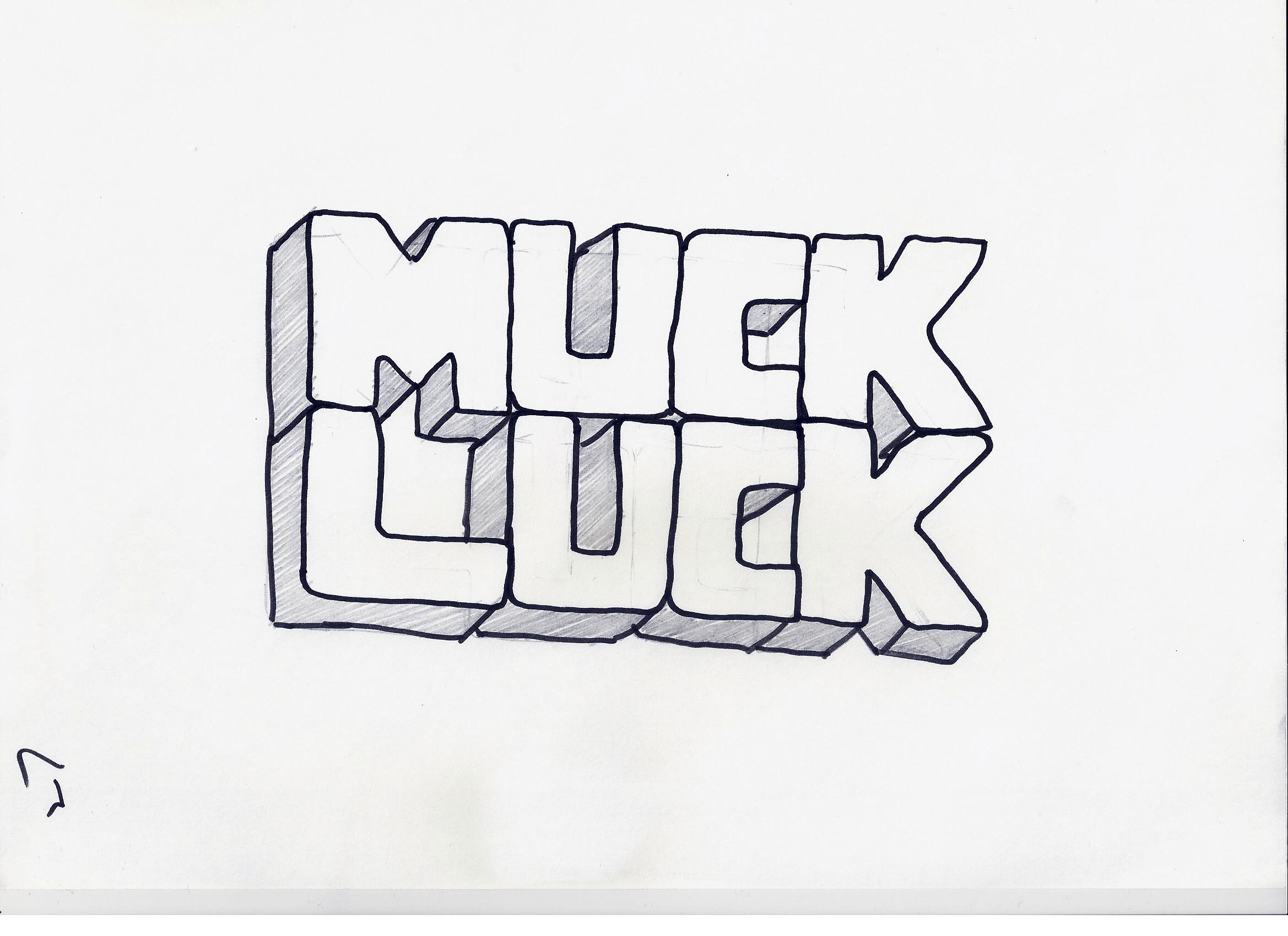
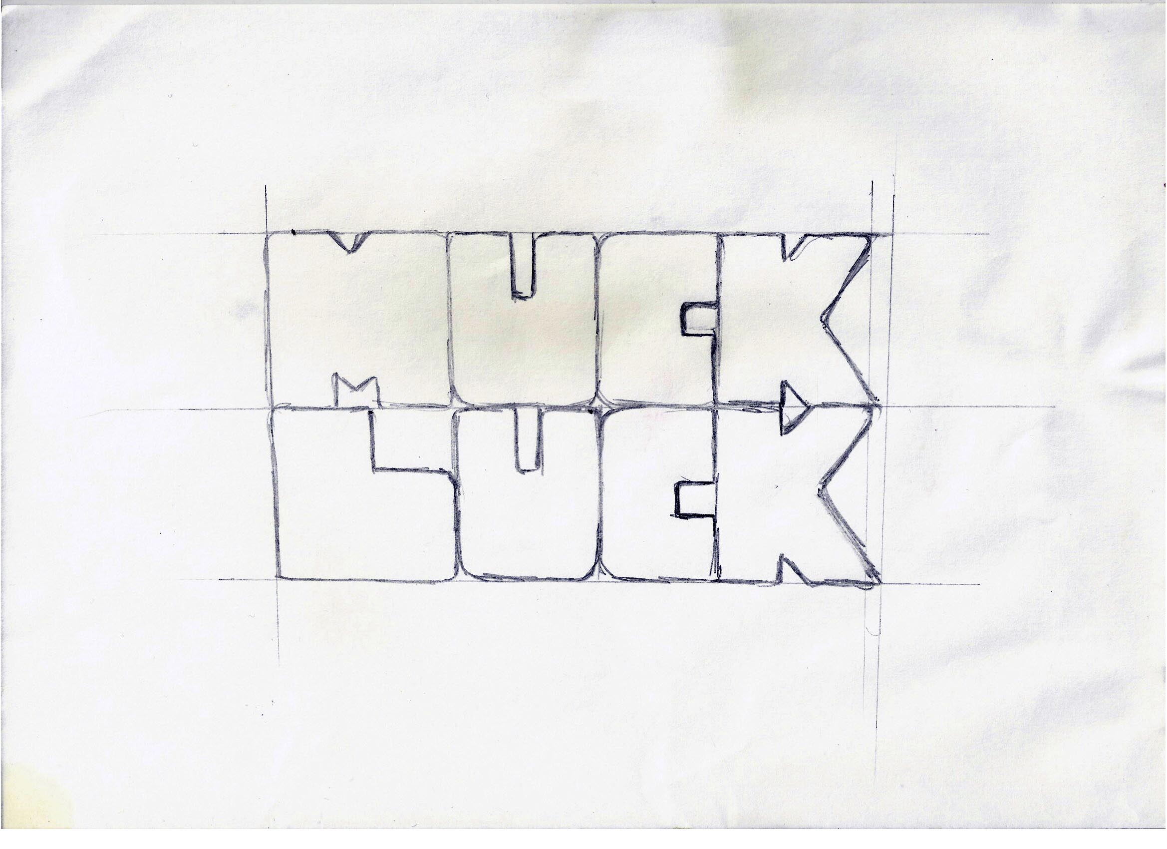
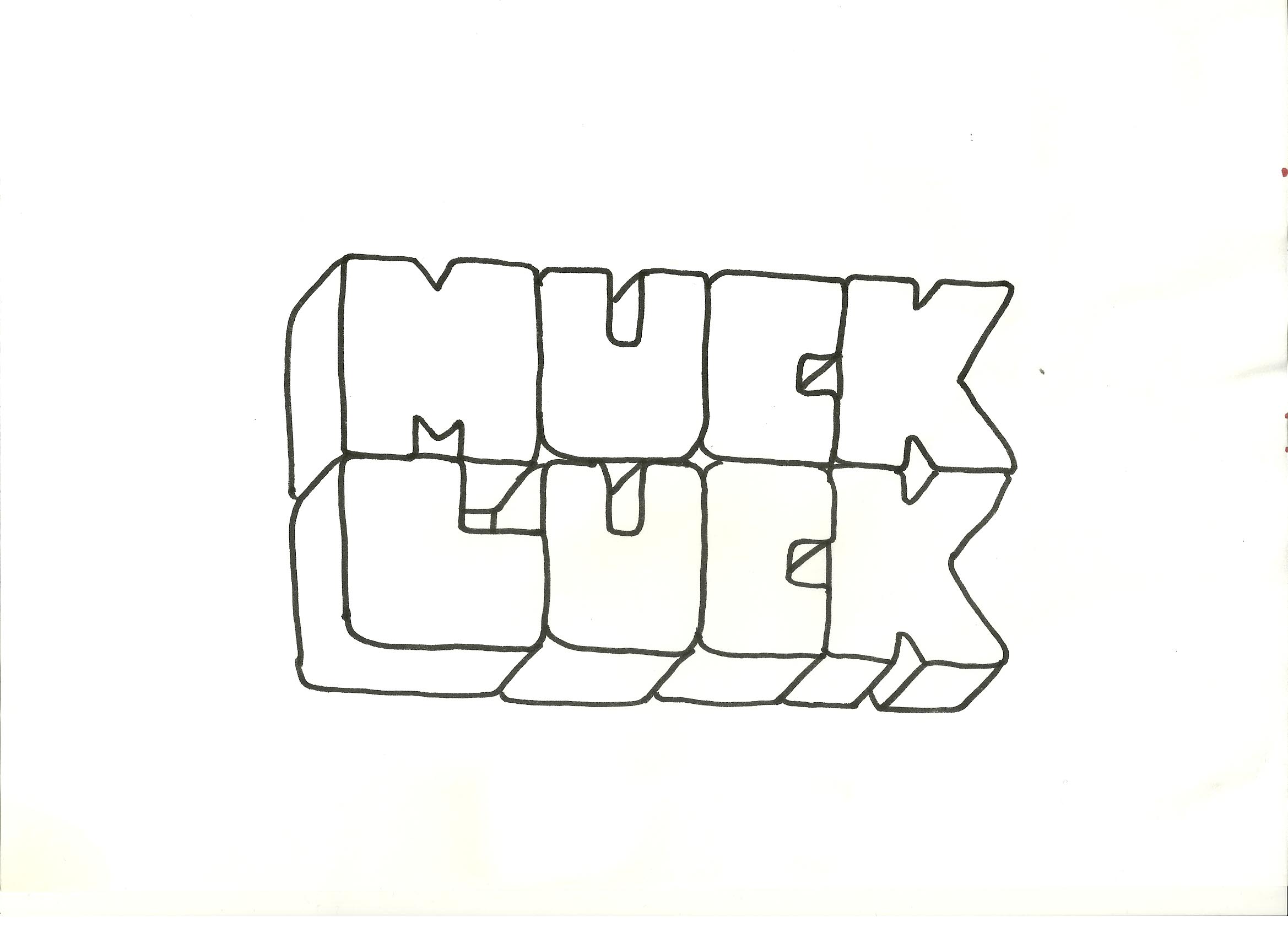
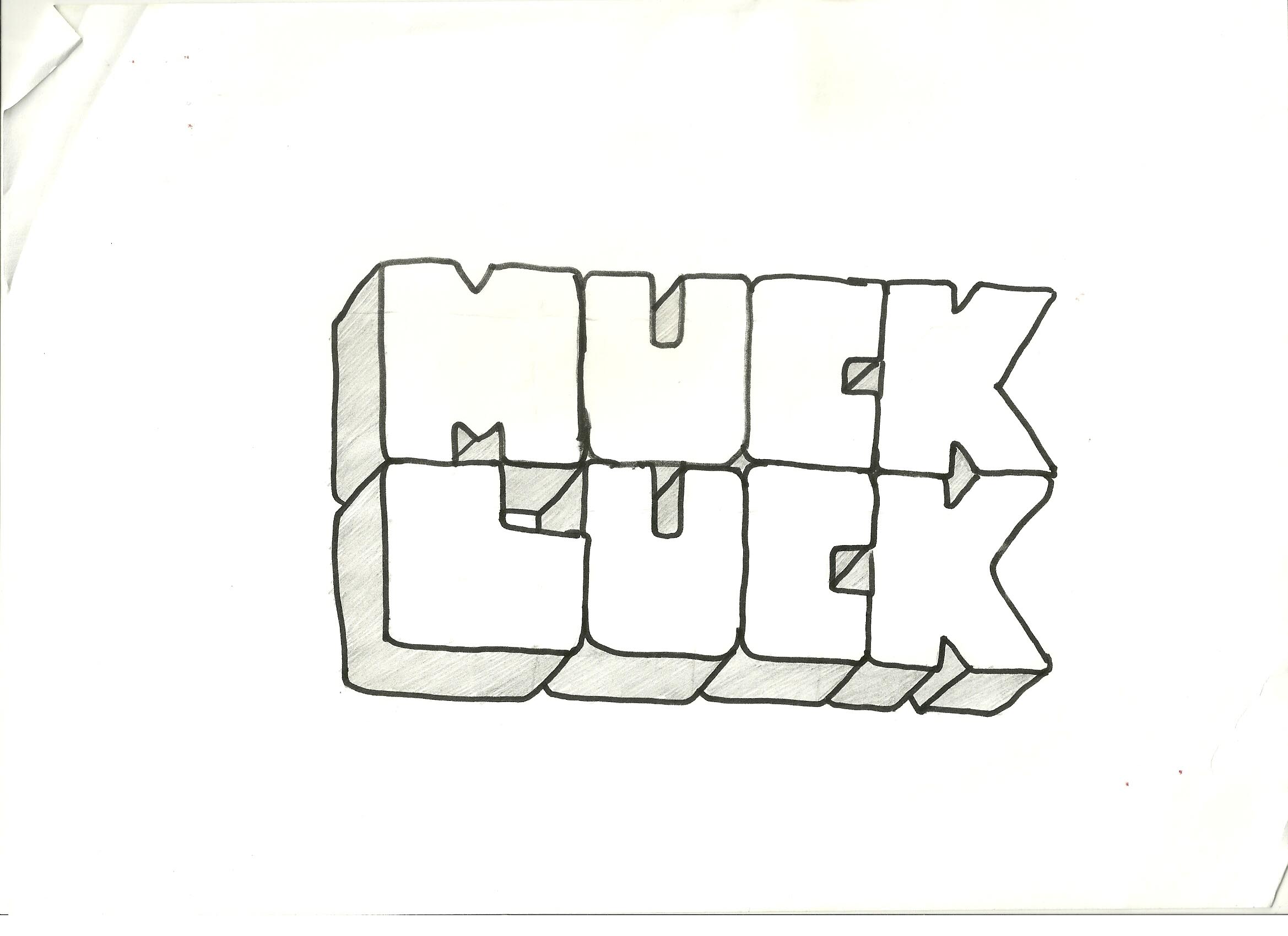
But how would I achieve that style? I looked around for fonts that better matched the wobbly design I was after. The previously mentioned Plump font cropped up and at one point I was very close to using that until a thought struck. If I wanted a homely hand drawn effect then why don’t I just draw it myself?
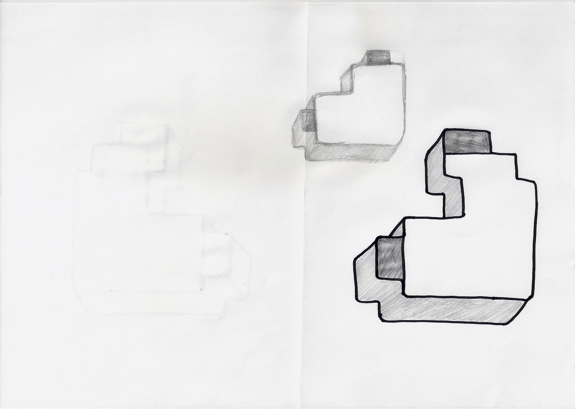
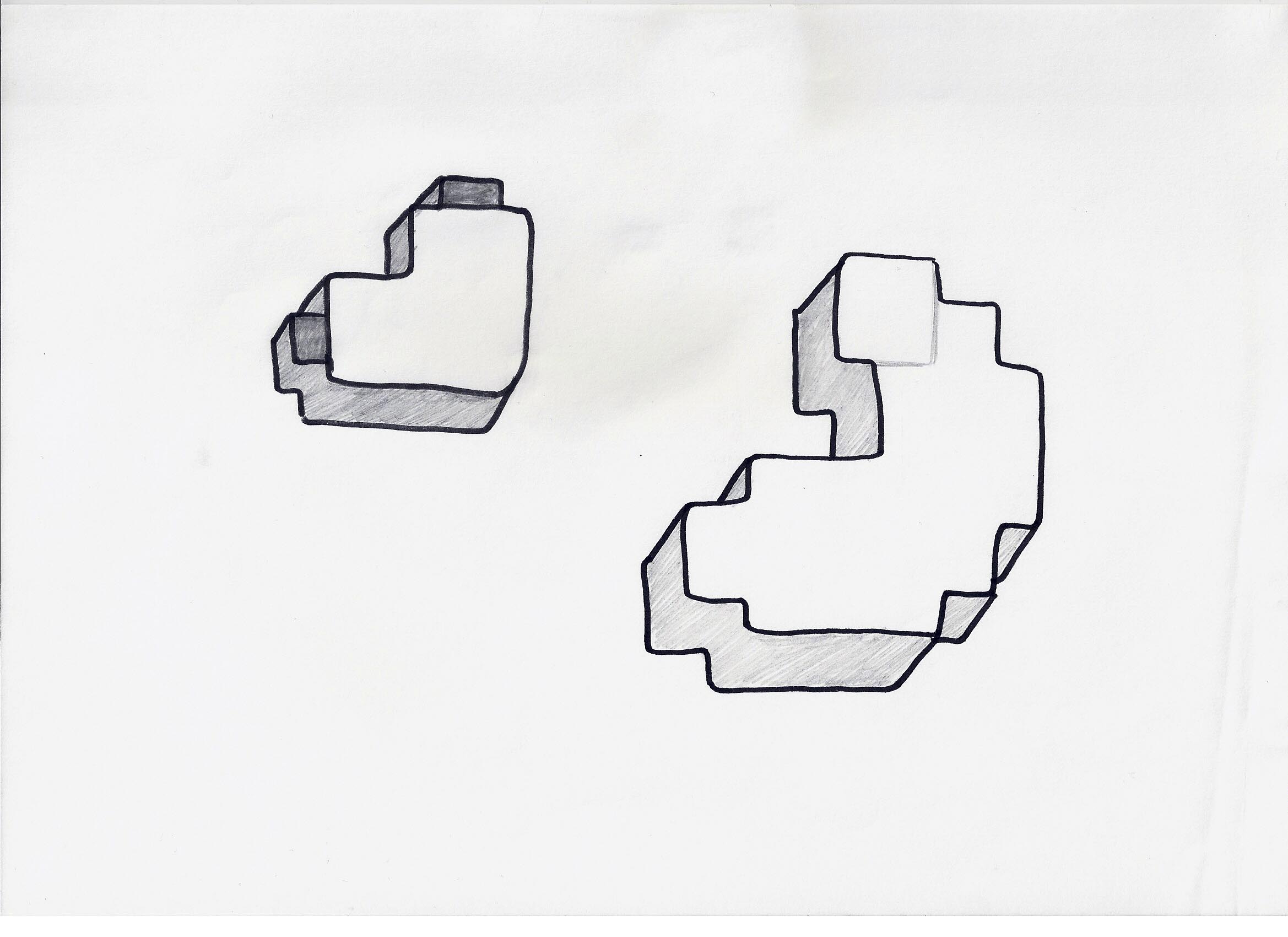
Bingo! I had the image of a new logo floating around clearly in my head. No existing font was going to match that so the smartest option was just to knuckle down and do it myself. I’ve heard from graphic designer friends that creating a font from scratch is an absolutely nightmare. It’s something never to attempt unless you really want to work hard and perfect it. I certainly didn’t have time for that over Christmas so instead I opted just to draw the letters of the logo and leave it there for now. I am quickly realising the need for a full version with every character but hey, that’s something for future Joe to worry about.
It took a couple of attempt to nail the look I wanted but let me tell you, there’s nothing better than putting pen to paper and figuring things out the old fashioned way.
 |
 |
 |
 |
 |
 |
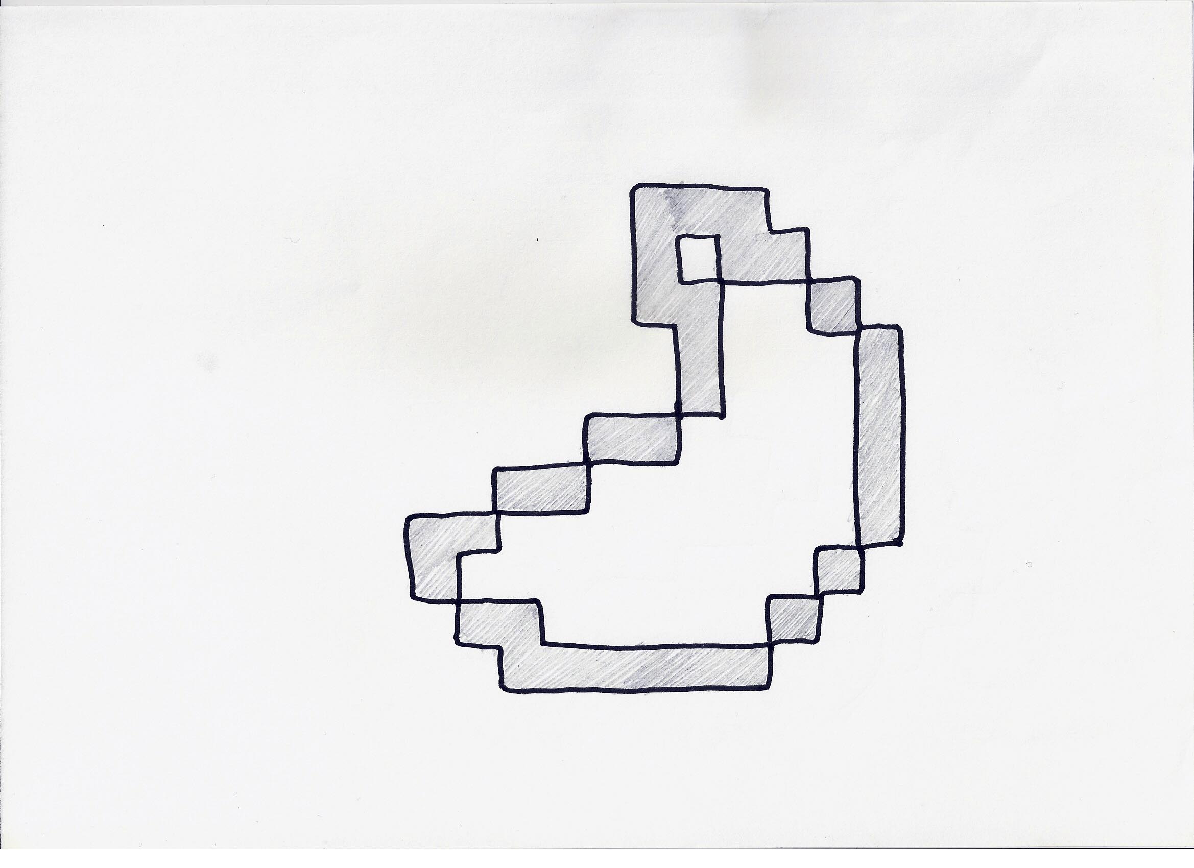
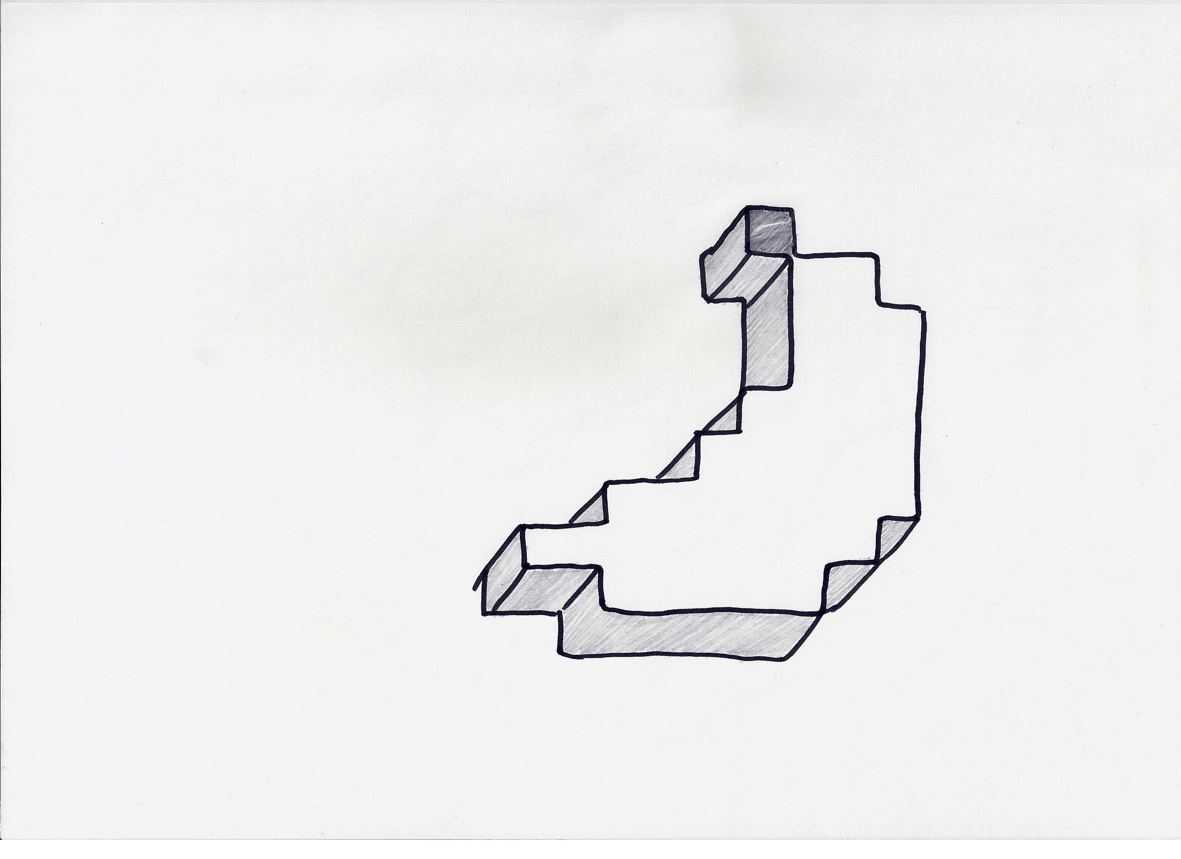
Oh and we can’t forget about the banana too. At one point I was very close to dropping it all together but I just couldn’t bring myself to do it. One thing was for sure though; the old pixelated design wouldn’t match all at anymore. Something had to be done. At first I messed around with simplifying it a tad, removing a few pixels here and there but it was starting to lose its shape too much. Then I noticed how the L from Muckluck sort of matched the curve of a banana and with a little flip and edit, it all worked out. I’m not sure I’m 100% happy with it but it fits and, like I mentioned, I’m eager to call attention to the word Muckluck instead anyway.
 |
 |
 |
 |
Finishing up
With the logo finished there were only a couple things to make before putting it all live. For a fast video intro similar to SuperMega, I decided to add a quick animation in making the letters ‘grow’ accompanied by a video game-esque sound effect. I actually created that sound effect myself using a brilliant website called bxfr.net which allows to you play around with all sorts of weird and wonderful settings. Go have a play around and see what you can come up with.
I put this animation on a clean blue background and, unlike in the past, I’m making an effort to stick to that particular shade of blue. No dodgy eye dropper tool on Photoshop to guess it, I’ve used it so much recently I’ve even got the hex code memorised. #1495ee! I’m dubbing it Muckluck Blue. Maybe try painting your walls with it, see how it looks.
The great thing about using a plain background is that it’s so customisable. Another concept I’ve always wanted to use is to alter my branding to match the theme of various Let’s Plays. Think of it like the old MTV idents or Ahoy’s numerous altered logos. And yep, you guessed it, SuperMega do it too. It’s something I could never really do before since I never had an intro but oh boy, now I’ve got lots of options and it didn’t take long to start using them.
 |
 |
Pair those with an updated outro which is organised a bit better and now finally includes a link to this blog and boom, we’re pretty much done! Oh right, the outro music. Perhaps I should gloss over that because instead of some nice royalty free track from Kevin MacLeod again or one from YouTube’s own copyright free audio library, I pinched the track from none other than Nintendo. Woops. Nintendo are perhaps the most fussy when it comes to copyright claims but to be fair, I did test it out and so far it’s been fine.
The tune is actually from Pilotwings on SNES, on the screen where you enter a password. Perhaps that’s just too oddly specific for Nintendo’s bots to pick up on but if anything does happen I’ll just change it. It was after hearing the track on one of Mike Matei’s live streams that I figured it was just too darn good not to use. Chiptune-y enough to match my video game related channel but also calm and unassuming enough to work as background music. Perfect!
Phew, that was more than I was expecting to write. I suppose I should get used to that – rambling is in my nature after all. And hey if you made it this far then well done and a big thanks for reading. It’s actually been a bit nostalgic digging through my old files and taking a look back at the visual history of my channel. The graphic design aspect of content creating has been a bigger deal to me than I’d previously thought – evidenced quite clearly by this nearly 3000 word post. I hope people like the new look I’m going for but if this load of waffle is anything to go by, no doubt it’ll be changing again in the future…